Colors make history
A color quiz.

Tree resin, bird droppings, earth or synthetic colorants: The origin of colors is varied, and so is their significance for our culture and everyday lives – and even our psyche. A brief excursion into the bright world of colors and paints
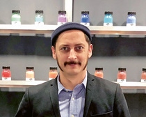
David Kremer | CEO at Kremer Pigmente
Ten years ago, David Kremer and the German artist Peter Lang were hiking in Iceland over glaciers, mosses and rocks. The two friends were hunting for the island’s distinctive colors. They scratched and dug around in the earth, and in the end, they secured the mining rights to three new earth colors – Snaefellsjoekull Red, Heydalsvegur Yellow, and Brimisvellir Green – named for the sites on the island where they were discovered. “The nuances resemble French and Italian earths but still have something very special and beautiful about them,” Kremer enthuses.
David Kremer inherited his father’s passion for pigments and now manages the business of Kremer Pigmente in Aichstetten, Germany – the company that his father established. The global market leader in historical pigments makes 250 of its total of 1,500 colors according to traditional recipes.
The hunt for new color pigments often involves digging.
Many of the pigment specialists’ raw materials come from nature: eggshells, bird droppings, ochre from Burgundy, green earth from Verona and pigments from the gland secretion of the purple snail. Their customers include artists and restorers from all over the world. The Louvre in Paris and MoMA in New York buy from Kremer, but so do companies such as BASF.
Art conservators, in particular, need natural pigments. This is because the best way to recreate a painting that was produced with local pigments in Italian cities such as Florence or Venice is to go back to local pigments from the relevant region.
But specific requests from artists can also be fulfilled. For example, if you wish to use iPhone gray for your painting or give it a touch of luxury with diamond powder, you can get it from Kremer.
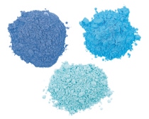
Kremer’s view of the world of colors is determined by colorfulness, materiality and the production process. “To me, a true color is anything that is pure and cannot be created by remixing,” Kremer says. One example of this is lapis lazuli. At a price of about €20,000 per kilogram of the highest-quality product, this deep blue semi-precious stone is the most expensive natural pigment. It is mined in only two countries. The best deep blue quality in the world is found in Afghanistan, but because of the political situation, it is hard to buy it. The stones that come from Chile are more pale.
Colors are a material and a commodity, but they are also loaded with many layers of meaning, impact and feeling. For example, in China, green is associated with the female principle of yin and serves as a symbol of long life and compassion. In Islamic culture, on the other hand, green is male, as the color of Muhammad. It denotes things like mental well-being and material prosperity. Europeans, meanwhile, associate green with growth and believe it is good against tension and stress – and so effective, in fact, that some health-insurance funds in Switzerland now support the treatment of burnout patients with green light waves.
A culture’s location in terms of climate also has a bearing on how colors are perceived. If you see red when you are angry, you are probably not a Russian. In very cold countries, red – as the color of warmth – has mainly positive associations. In Russia, red means something valuable or beautiful, and the metaphor that translates literally as “red word” denotes a witty remark. In Arab culture, where scorching heat can become life-threatening, red represents something demonic. In China, it is the color of happiness, and many small children wear red clothes.
When trend consultant Michell Lott from São Paulo, Brazil, is developing color trends, what matters to him is not so much cultural symbolism as current needs. As a color expert, he conducts worldwide research to absorb moods from which he can create new color palettes. Currently, for example, one of these is for Suvinil, a BASF decorative paint brand for surfaces such as walls, furniture or floors, marketed in South America and selected African countries.
“Colors are energy. You absorb them when you enter a room,” the interior design expert says. In the year of the coronavirus pandemic, its screaming flood of news, and worries about people’s families and jobs, Lott encountered a need in society for calm and reassurance. This withdrawal into an inner world required colors that would not provide additional bursts of energy to unsettle people even more. He developed a color range containing subtly pigmented white tones with different degrees of saturation. In Lott’s view, mineral coloring, bright green tones, and earth and brown pigments reflect the desire of people stressed by the pandemic to form a bond with nature.
Now, stronger dashes of color are again becoming mixed in with the calm tones in the color palette that Lott developed – some blue here, or candy orange there. For the color consultant, this expresses the desire to return to more vibrancy after long lockdowns. But these richer colors also represent technology and digitalization. Nevertheless, Lott is convinced that “the trend toward natural earth tones will continue for ten to fifteen years.”
Mark Gutjahr | Head of Automotive Color Design, EMEA, BASF Coatings
Working with the global design team, he has developed a trend radar that observes, for example, how values in a society shift over the long term. Since the aim is to translate trends into colors for automobiles that match the spirit of their times, there is no room for short-term color trends that only last for a year, as they do in fashion. Vehicle colors have to remain current for more than one season. This is due partly to the development cycles and marketing activities of vehicle manufacturers and partly to their customers. Germans, for example, drive their vehicles for around nine-and-a-half years on average. It takes two to three years to develop a vehicle paint and make it ready for series production. Gutjahr and his team are constantly working on their trend research, so that they are always able to develop and present new color nuances.
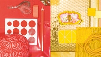
Images here and far right: When interesting color tones or special surfaces catch Mark Gutjahr’s eye on his travels, he collects those objects and sorts them by color. Such mood boards are an important source of inspiration for him.
Gutjahr was already observing the trend toward warm color tone ranges in pre-coronavirus times. “These tones represent a desire for a more empathetic society, as well as the global phenomenon that people no longer want to organize their life plans exclusively according to the performance principle,” the BASF design chief says. The pandemic has further strengthened this trend.
Consequently, beige has become a new trend color in the latest color palettes for automobiles. Gray tones are becoming gentler and less metallic, and a mineral quartz gray is appearing with many manufacturers. Warmer color tones are gradually infiltrating themselves among the harsh, bluish paints on the roads. With his 33-year-old Porsche in metallic nougat brown, Gutjahr is therefore very much in line with the trend. A Porsche color also currently inspires the design chief: frozen berry. This new, warm, gray-pink color tone shows that even sporty automobile types are not immune to the trend toward a new gentleness.
However, the roads are still dominated by different colors. White accounted for 26 percent of new registrations in the Europe, Middle East and Africa (EMEA) region in 2021. Gray ranked second on 23 percent, followed by black on 15 percent. The most popular colorful tone, on 14 percent, was blue, which manufacturers used in around 180 different color nuances. The proportion of bright colors is slowly increasing again in all vehicle segments. A quarter of all mid-range vehicles are painted in a chromatic shade. For larger vehicles, the figure is as high as 30 percent – as it is for small cars, where color diversity is at its highest.
For drivers who show color courage: the color Parolis Purple, developed by BASF Coatings
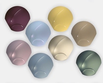
BASF Coatings uses such domes, as they are called, to show how color tone and shapes interact.
The courage in color choice that drivers demonstrated 30 years ago has now become a thing of the past. “The past two decades have been the least colorful,” Gutjahr says. The silver of the noughties gave way ten years ago to white, which is now the most popular vehicle color worldwide. White is considered to be clean, elegant, classy, timeless and classic – especially in China, where more than half of new vehicle registrations are white.
In theory, drivers can now choose from 250,000 colors. However, although so much is now possible, nature offers displays of color that are extremely hard to replicate artificially. The thrilling color appearance of the bird of paradise, whose plumage changes between orange-yellow and blue-green depending on how the light falls, is missing from the standard repertoire of color designers and pigment miners. The bird owes its iridescence, which remains inimitable to this day, to its plumage, which is structured and arranged in a very distinctive way. Companies such as BASF are experimenting with new artificial carrier substances that are intended to catch the light so that it shimmers like
the plumage of the bird of paradise.
While industry continues to work on new levels of perfection, Kremer carries on searching for the kinds of irregularity that only nature can offer. He is currently focusing on a specific tree resin – one that can be used to make a varnish that is less clean than those currently available. This is the object of desire for ambitious violin-makers, who are on the hunt for the best possible reproduction of the unique Stradivarius sound. To create that, the violin needs a varnish from naturally contaminated resins of the sort that Antonio Giacomo Stradivari found at the end of the 17th century.
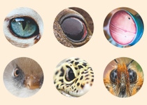
Human beings can perceive between 100,000 and 1 million colors through three types of color receptors (sensitive to blue, green and red). But it gets even better. The animal kingdom has specialists in ultraviolet (UV) light and masters of spectral color vision – but also some that are color-blind. Here is a small selection.
like most land mammals, possess only two different types of color receptors. They can see their surroundings only in shades of blue and yellow. However, their eyes are better at perceiving movement than those of human beings, and this is important for them as hunters.
are masters of color vision. In addition to red, green, and blue, they can see short-wave UV light. This enables them to better identify leaf structures, and that helps them to find their way in a forest.
such as whales and seals have lost a color receptor in the course of evolution and, as far as is currently known, see the world only in
black-and-white and shades of gray. The eye of a baleen whale can actually distinguish only between light and dark.
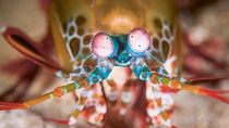
perceive the basic colors of their surroundings extremely quickly with more than ten different color receptors. This saves the brain energy and time when the shrimp is identifying its potential prey.
Nocturnal geckos use their three types of color receptors to see in weak light. This means their world is full of colors even at night. Most other vertebrates and human beings, on the other hand, are color-blind at night.
The color champion among butterflies is the hummingbird hawk-moth. It possesses 15 different color receptors – five alone for red light and several for various blue and green tones and UV light. They probably help it to find hidden flowers.
